
Over the course of my career in digital marketing, I have created many SlideShare presentations for my company and also have seen my colleagues creating some beautiful and awesome presentation.
But in my opinion, some of the presentations (including mine) were poor in design, content, and structure.
And, that’s OK. We learn by doing mistakes.
When it comes to creating presentations, the design is not enough. I’d say the presentation is like a cake where each piece consists of content, design, call to actions, references combined together with the flavour of logical flow, structure, and storytelling.
Your content needs to be high quality, informational and structured in a way that it not only easy to understand but also easy to interpret along with images.
Similarly, visual elements such as images, charts, should be eye-catchy, relevant and soothing so that your content can stand out online.
I know you are wondering how to do that? How to make the presentation that not only captures your viewer’s attention but also adds a real value to them and breaks the competition?
Source: How Google Works by Eric Schmidt
Well, if you are seeking an answer to this question, below are some of the tips and best practices (from my experience) that will make your SlideShare or PowerPoint presentation look both engaging and more memorable.
1. Structure and Design
We should start somewhere creating presentations. What do you think what should be the first thing to come?
Structure and design should come first.
Structure defines what your presentation made from (it includes your content, images etc.) not what your presentation is.
According to a research, meaningful structure to your content provides a powerful way and make people retain structured information up to 40% more than the information that is presented in a more freeform manner.
Let’s assume you are educating people about the “benefits of using a toll free number” for their business.
To explain these benefits and persuade people, you can follow ‘Problem-Solution-Benefit’ structure in which you first define specific problems that one faces without toll free numbers, then you explain a solution to address the problem, and finally, you clearly describe benefits to your solution.
Try and experiment with other structure as well that fits your business objectives and meet the audience’s need.
I suggest you to choose the presentation structure, especially content, before going to the next level.
Designing is not only about images, vectors, etc. to include in your presentation but also, in reality, it means how to make a good use of space in your slides.
Consider using these tips in your SlideShare presentation.
- Choose a design or template to start with
- Keep the template design consistent
- Keep typography, fonts and font size consistent
- Bold the text or use colors for emphasis
- Quality images matter, don’t use images that pixelate. Pixabay, Pexels, and Unsplash are some of the good places to free and HD images for your work.
- Bigger images are always the better ones
- Match the color of images with the slide template and text
- Align carefully – each element should be in harmony with the alignment
- Try to explain one point per slide
- Avoid fancy fonts
- Use whitespace to have a neat and clean design
- Make good use of branding
- Avoid using too much text in one slide; slides are free, add one more. 🙂
- Use contrasting colors to improve readability
- Make changes to Slide Master, if you want to change and keep the same font and images in all slides.
Want to know my best advice on design?
Don’t let PowerPoint decide what you’ll design. Control and play with the features it provides. You can also use tools like Canva and Prezi to create amazing presentations.
2. Clearly Communicate Your Concept
Think like a wise man but communicate in the language of the people.” – William Butler Yeats
Once you are done with the structure and design idea of your presentation, consider asking some of these good questions –
- Who is my target audience? Will they love jargons and ‘technical details’ of something that I’m going to explain in the slide?
- Which part of the presentation do you want to emphasize more?
- Is your presentation crafted into a story? What do you need to make it a story – data, insights or visual?
- Do you need to show evidence (data and facts) to prove your story?
- Would you love to present this in real in front of your audience?
In my opinion, great presentations are easy to understand, memorable and free from complexity and confusion.
Using visual metaphors are one of the great ways to clearly communicate your concept which simply means the representation of an idea, person, place or thing with a visual element that shares the same intent and similarity.
For example, highlighting bulb among few dim light bulb can represent the ‘idea’ or ‘thinking outside of the box’.
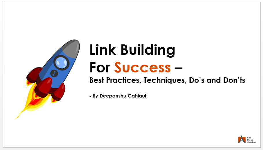
Recently I used this concept in my presentation on ‘Link Building for Success” where I used a rocket ship as a visual metaphor to represent success and growth of a business.
If you can’t explain it simply, you don’t understand it well enough. – Albert Einstein
3. Create a Logical Flow
Some presentations are crap, even if they are good in structure, design, and content.
What they miss is simply the navigation, logical connectivity and a clear arrangement of sides.
Remember the “Problem-Solution-Benefit” structure. What if you give benefits just after the Problem or you start with your presentation with the Solution?
The idea is – there should be a reason why one point comes before/after another.
You got it, right?
Let me add something more to it. We, as a human being, are always full of thought. If we’ve seen something, our mind will recall everything you know about it and build the stories about it.
When you are showing your audience a ‘problem’ in your presentation, they will relate to it and always thought of the ‘Solution’ next in their mind, not the benefits of ‘solution’ which has not yet been introduced in your presentation.
So this flow is intuitive, and make things clear and simple for your audience.
I suggest you to stick to one flow structure in your presentation –
- if you are showing problems, give them a solution
- If you are showing them features, explain the benefits
- If you are showing them opportunities, describe how to leverage it
There are various possible flow structure in a presentation; Jerry Weissman lists sixteen in his book “Presenting to Win.”
Source: What Would Steve Do? 10 Lessons from the World’s Most Captivating Presenters by HubSpot
Another tip is that you should start and end with the same ‘idea’, ‘thing’ or ‘story’ you began with.
For example, you have build your presentation content story around a woman, named ‘Lisa’, but in the end, you conclude with a different story of another woman, “Emily”. It will look like disconnected and unorganized.
4. Have a Call To Action
You are making presentation with a purpose. Isn’t it?
Whether you are educating your audience, selling something, or promoting your business, they should have something to do when they complete your presentation.
Conclude your presentation with the summary of your topic, your business introduction and action steps.
Match your action step with your goals.
For example, if your using “Problem-Solution-Benefits” structure, giving the website link, free trial option, or demo of the solution is a good way to conclude your presentation.
Your call to action should:
- Evoke emotions, such as “Have something to say,” “you have nothing to lose, sign up now!”, “Join the movement,” etc.
- Evoke urgency such as “Try Now,” “Buy Now,” “Limited Period Offer,” etc.
- Evoke action such as “Download Now,” “Subscribe Now,” “Call a Solutions Consultant,” etc.

Source: What’s New in QuickBooks 2019 by Aditya Prakhar Singh
Conclusion
I’d encourage you to follow these tips to create an awesome and memorable presentation for Slideshare.
- Goal: Think about your presentation goal.
- Audience: You are creating it for your audience.
- Content: Research. Research. Research
- Design: Look nowhere, SlideShare is great for the design inspiration. Borrow from the great design.
- Focus: Storytelling and the essentials only.
Implement these and I hope your content will be easy for your audience and viewer to digest and will give you the chance to celebrate the success of your presentation. 🙂


 Mohit Rajput’s “Socha Na Kyon” is for those who can’t express their love